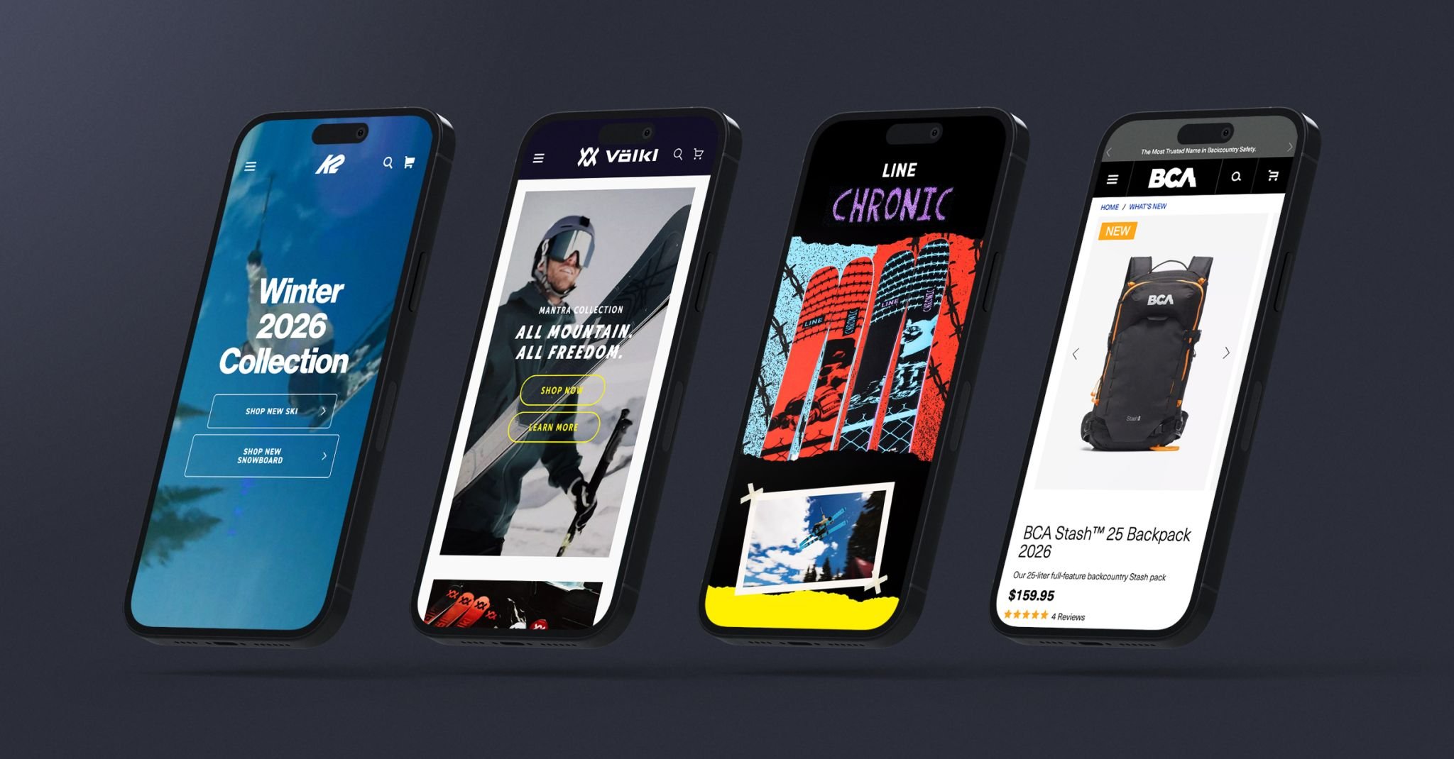
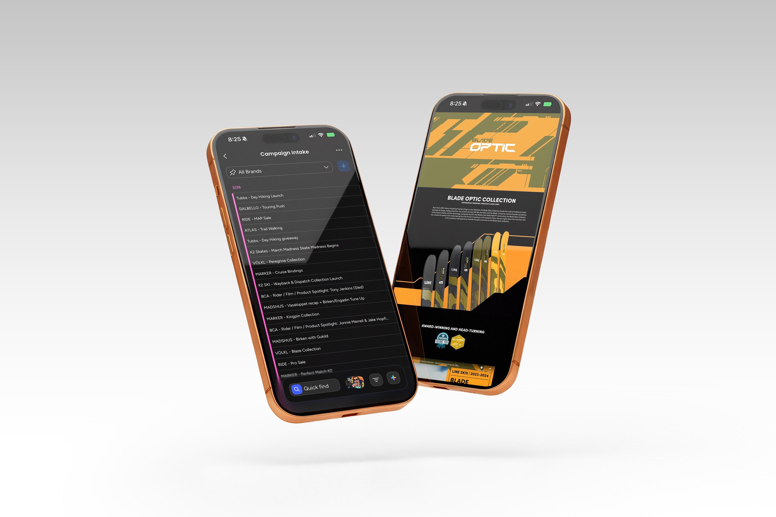
UX & UI // E-Commerce // Product Design // System Management // Development
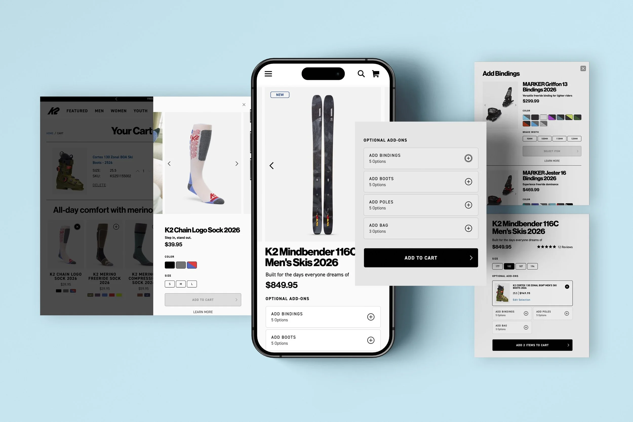
Product Add-On UX
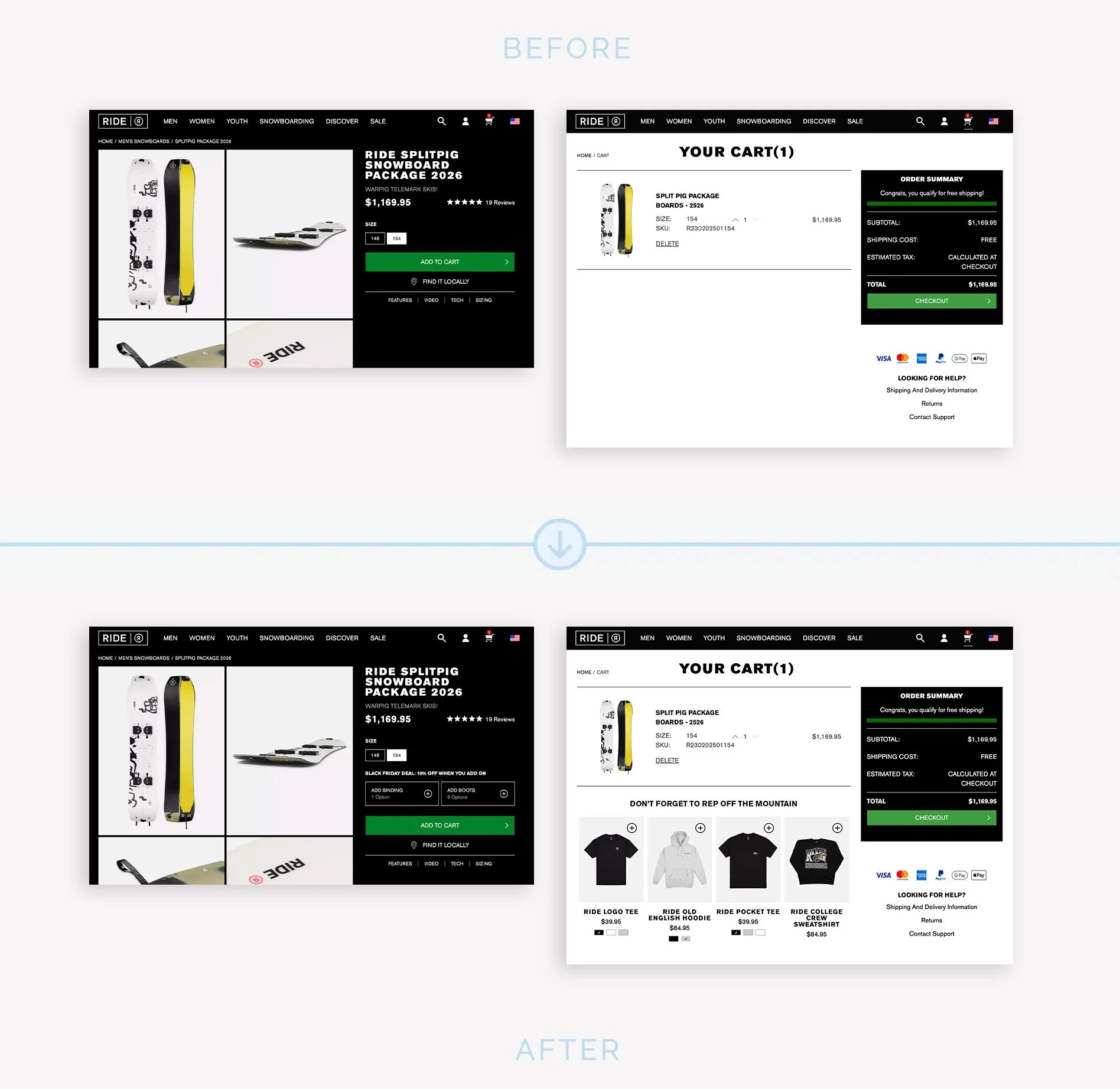
Cart & Product Page
Designed an intuitive add-on experience that streamlines product customization and boosts conversion. Simplified selection flow, clarified pricing, and enhanced visual feedback to reduce drop-off and increase user confidence. Result: smoother checkout and higher average order value.
Overview
Role: UX Manager & Team Lead
Timeline: 3 months (MVP phase)
Team: UX, UI, Development, E-Com Ops
Tools: Figma, Big Commerce (Backend), ContentStack (Headless CMS), Clarity, Google Analytics.
Outcome: Designed and built a scalable product add-on system on product pages and cart that streamlined customization, improved clarity, and boosted checkout conversion. Rolled out to 13 brand sites as a shared MVP module.
CONTEXT & PROBLEM
Across 13 e-commerce brands, users frequently encountered confusion when trying to customize products or add compatible accessories. Pricing wasn’t transparent, selections weren’t clear, and the flow often felt disconnected from the main checkout journey.
The result: users hesitated, abandoned the process, or purchased without understanding what they were getting, directly impacting conversion and average order value (AOV).
Goals:
Simplify the add-on selection process
Clarify pricing, availability, and compatibility
Improve visual feedback during customization
Build a reusable system component deployable across all brands
Boost user confidence and AOV
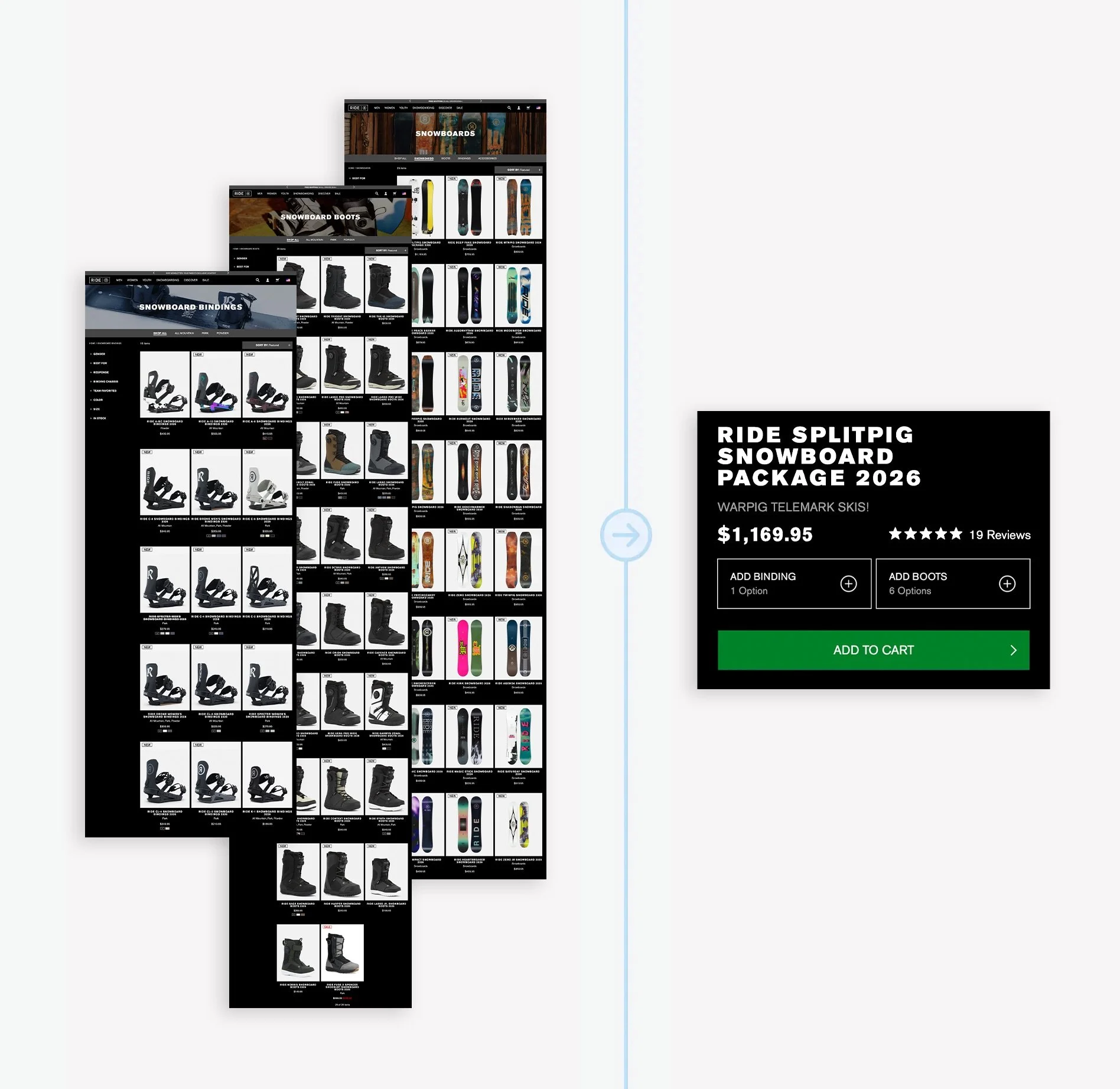
RESEARCH & INSIGHTS
Before designing, we analyzed behavioral data and reviewed existing add-on flows across our brands and competitors. We paired analytics insights with qualitative research from support tickets competitor analysis, DTC team feedback, and user testing sessions.
Key Insights
Cognitive overload: Too many OR too little choices displayed at once caused decision paralysis.
Hidden pricing: Users couldn’t see updated totals as they added options.
Visual disconnect: Accessories didn’t visually connect to the main product, reducing confidence.
Inconsistent behavior: Each brand handled add-ons differently, no shared logic or UX pattern: Compatible products, packages, deals/promos, swag add-ons, bags for carrying, etc.
Performance friction: Some add-on flows required full page reloads, increasing abandonment.
What This Meant for Design
The experience needed to:
Present only relevant options at the right moment.
Provide real-time pricing updates and clear visual confirmation.
Follow a unified system pattern so it could scale across multiple brand sites.


IDEATION & EXPLORATION
We began by mapping different conceptual models for how add-ons could appear within the shopping experience:
Inline Add-Ons inside the product detail page (PDP)
Modal Selection triggered post “Add to Cart”
Side Drawer Flow allowing dynamic updates without page reload
After testing prototypes internally, the inline modular design with fly out proved most effective — balancing visibility and simplicity.
Exploration Themes:
Progressive disclosure: only show add-ons relevant to the selected product variant
Visual hierarchy: prioritize compatibility and visual preview
Accessibility: ensure screen readers recognized updates to price and selections

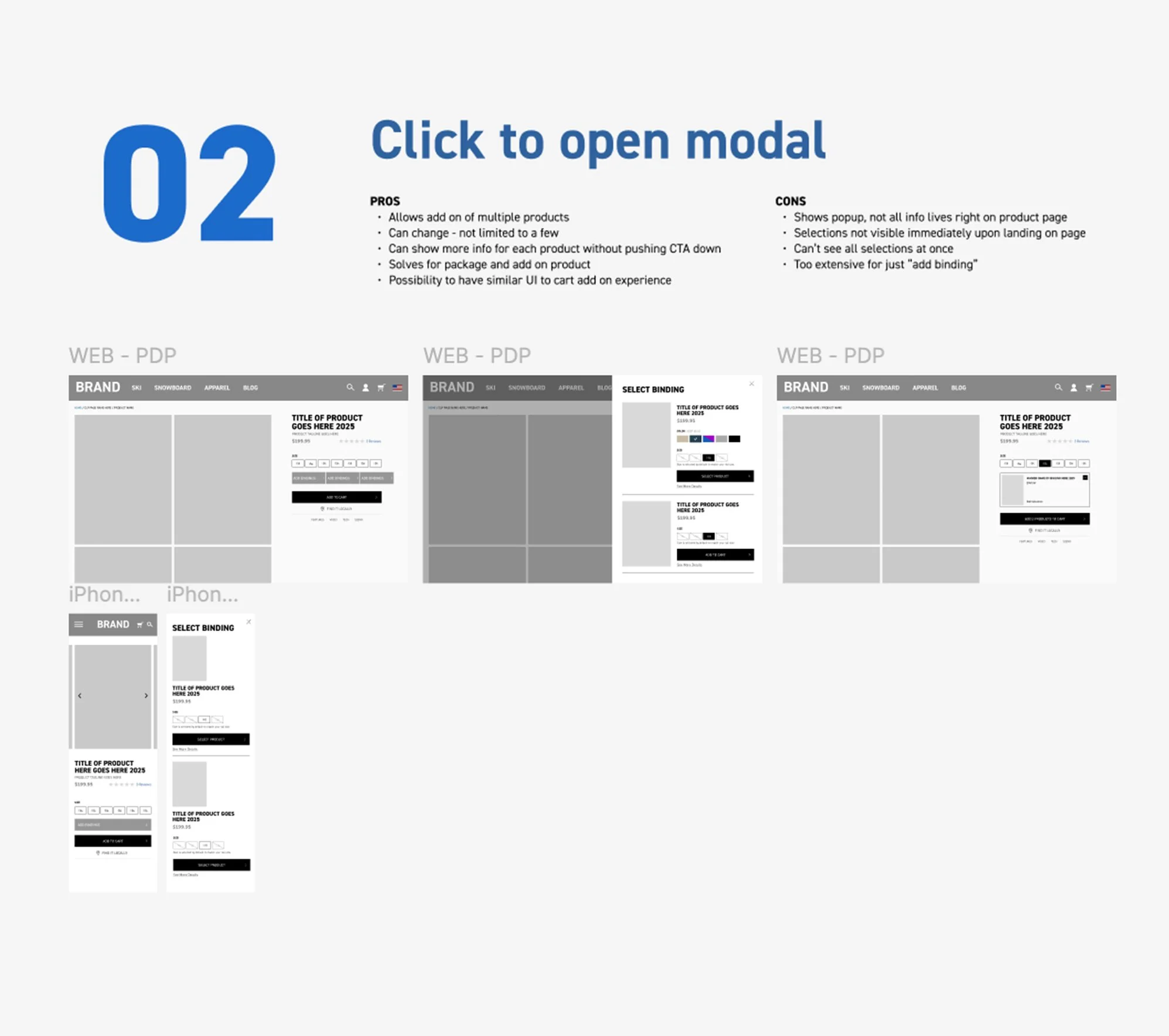
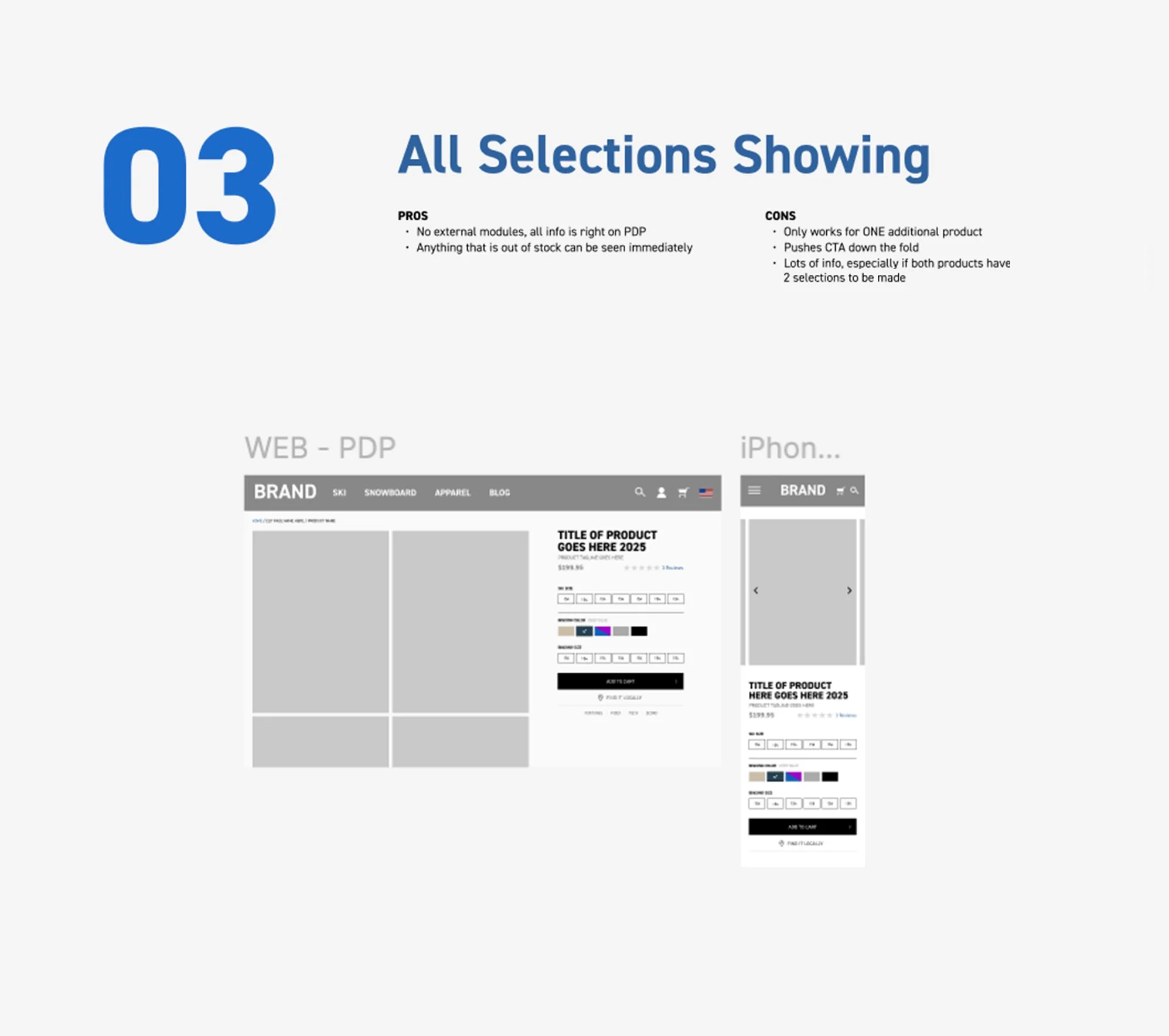
DESIGN & ITERATION
The design evolved through iterative feedback from UX testing sessions and cross-team reviews.
Key Improvements:
Introduced dynamic add-on modules with real-time price updates
Added visual pairing cues (thumbnails, compatibility labels) to link accessories with main products
Simplified copy and added clear “How To” states
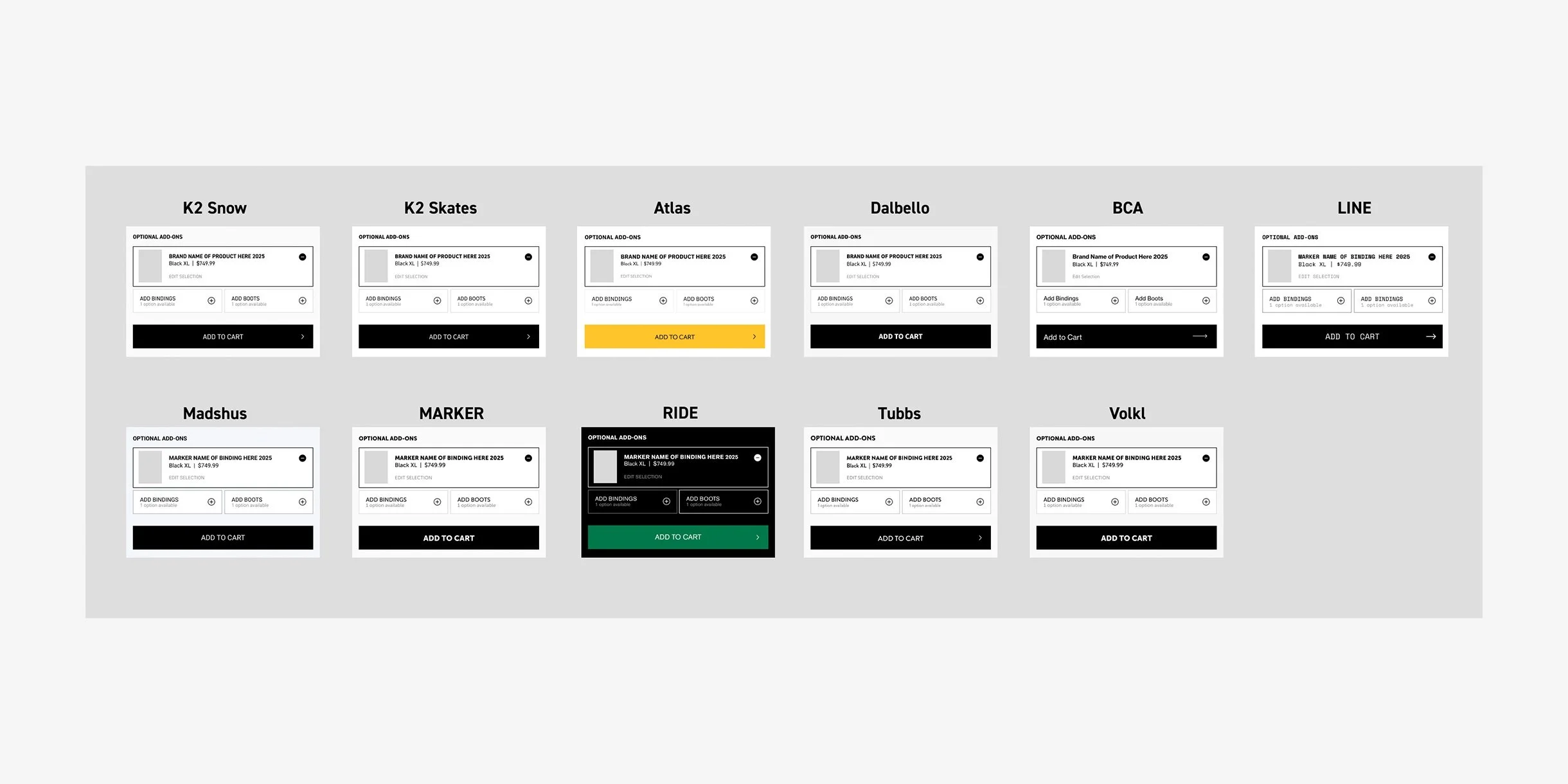
Ensured consistent add-on logic across 13 brands through component guidelines
Streamlined for mobile-first interaction with collapsible sections and visual movement cues
Each iteration focused on clarity, reducing friction, and creating trust through predictable behavior.
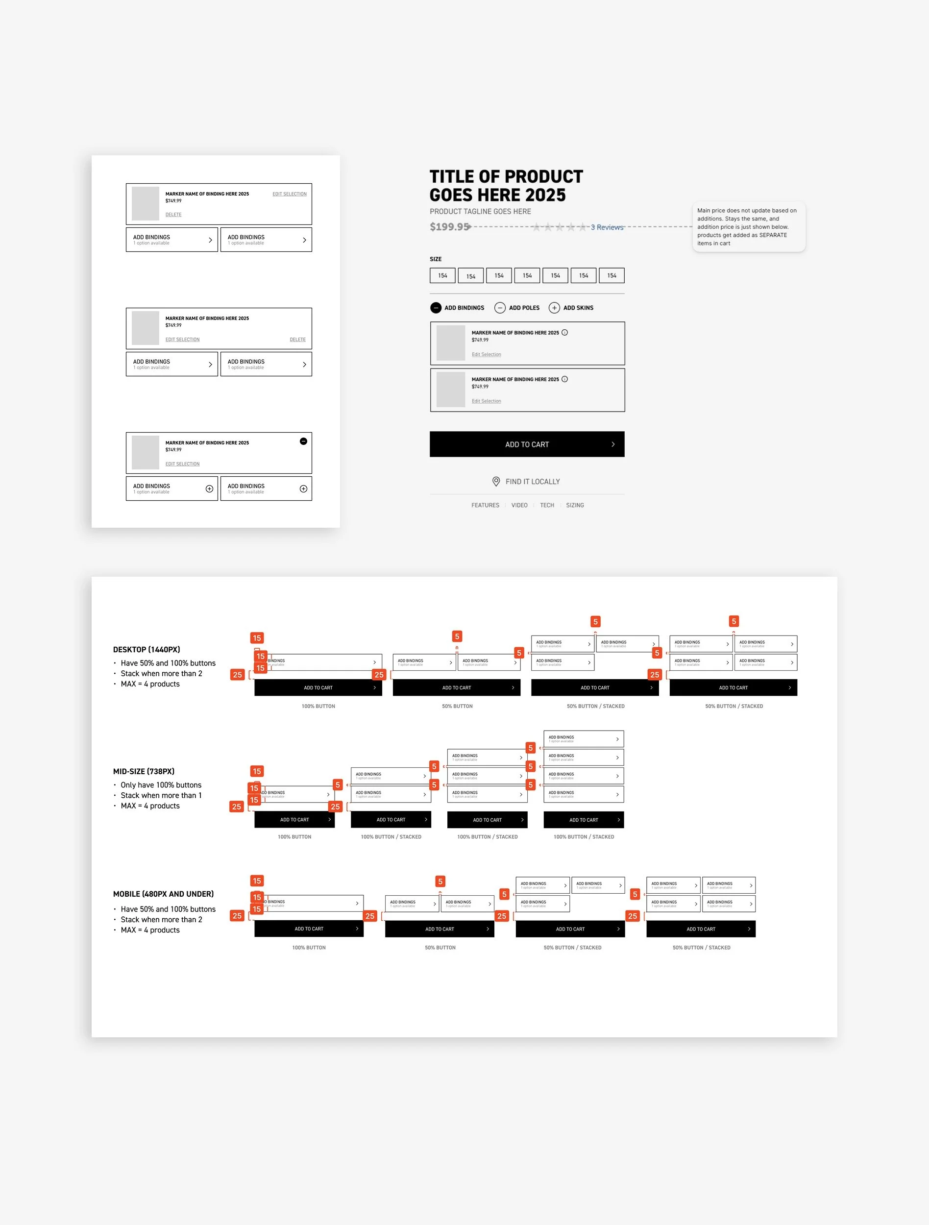
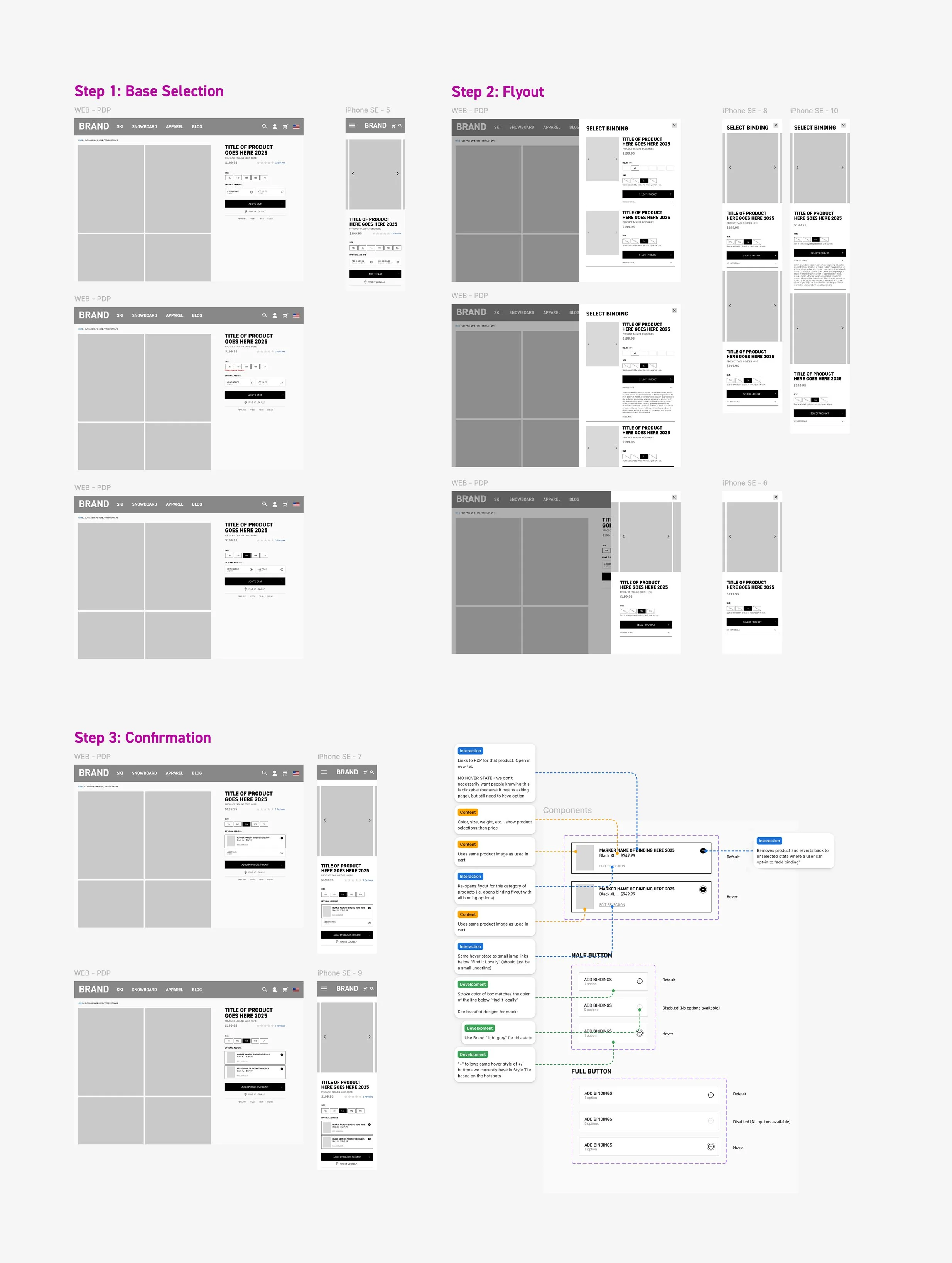
FINAL SOLUTION
The final Product Add-On UX created a seamless customization experience directly within the product page.
Users can now explore compatible add-ons, view pricing updates instantly, and check out with confidence, all without leaving the page.
Highlights:
Real-time pricing and stock feedback
Modular design system deployable across 13 brand sites
Scalable architecture integrated into the headless CMS
Performance optimized for global rollout
PDP and Cart functionality
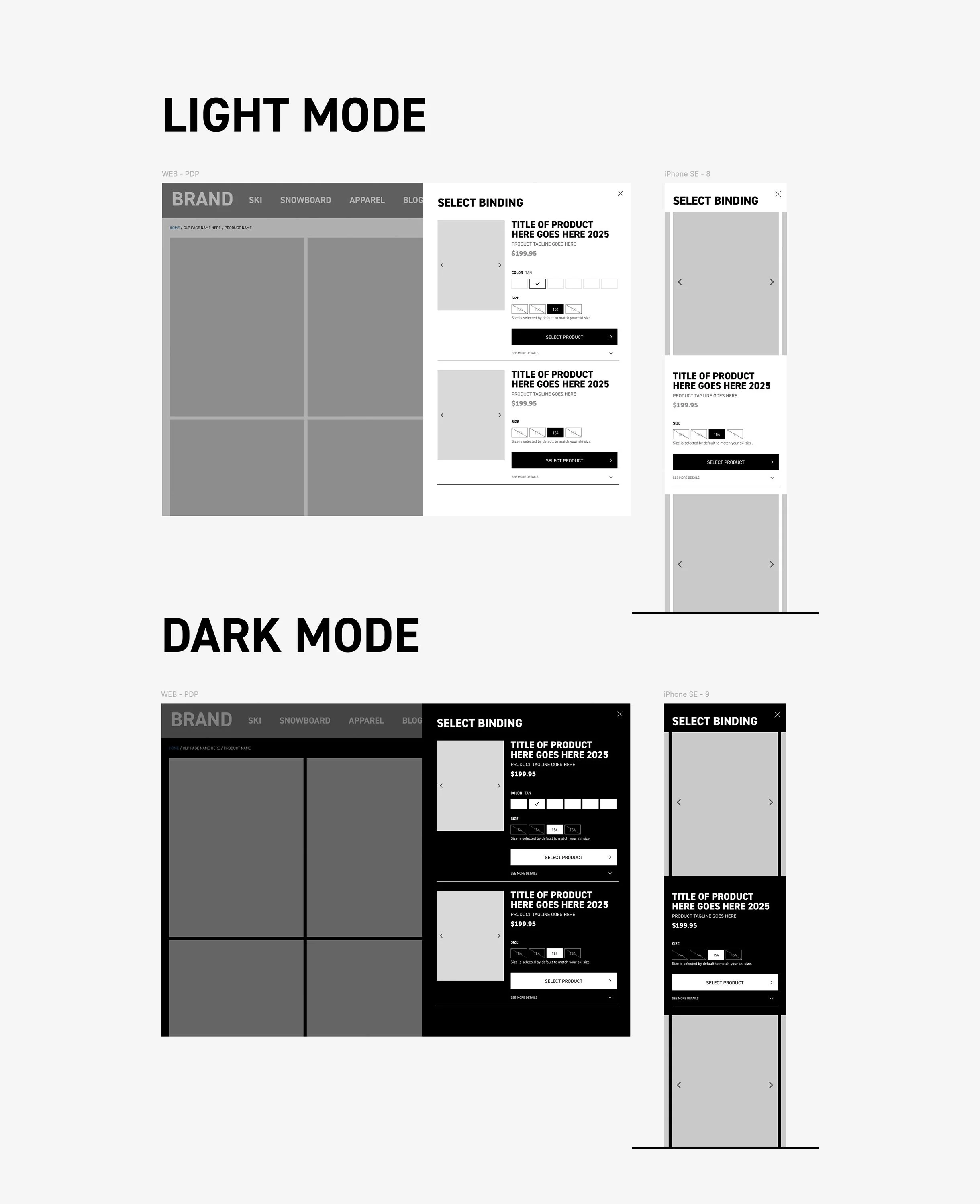

IMPACT & LEARNINGS
Impact:
Increased add-on attachment rate (items added per order)
Improved checkout completion rate through reduced friction
Higher average order value (AOV) across key brands
Established a system component now used across the e-commerce ecosystem
What I Learned:
Small UX optimizations can compound into major revenue impact when scaled.
Designing for consistency and flexibility enables rapid deployment across brands.
Visual confirmation and price transparency are key drivers of user trust in commerce flows.
Next Steps:
Expand add-on functionality to support bundled discounts and personalized recommendations
Streamline promotions and sales flow to improve customer experience
Teach the merchandising and marketing teams these new enhanced tools to tell stronger, more cohesive product stories.
Run A/B tests on layout variations to identify performance optimizations
Analyze user pain points and iterate on initial design solutions
